Ever wondered why your website lacks leads or buyers? If so, you've landed on the right article. While product-related issues such as market alignment and marketing budget are common culprits, the real devil might be hiding in your site design. Unseen and often overlooked, it could be a slow-loading page, poor design, unclear user experience, or insufficient site security impacting your sales. In this article, I'll delve into each of these issues, examining their specific effects and offering solutions.
10 Reasons Why People Don't Buy From Bad Website
In this section, let's dive into the most prevalent issues causing a high churn rate. The key is to identify and address them promptly, and I genuinely hope that the insights below will assist you in preventing significant customer losses on your site. To reinforce each point, I'll include statistics from reputable publications.
Absence of Security Certifications
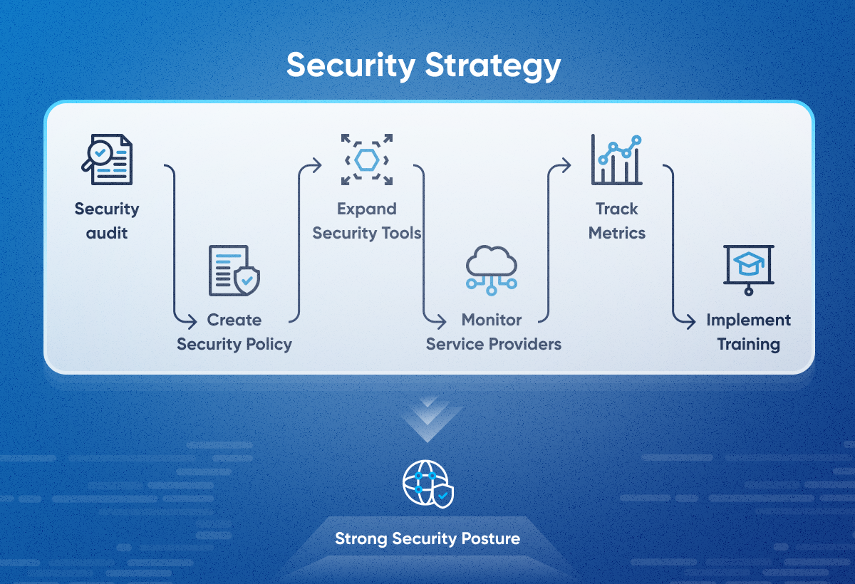
Did you know that there are approximately 2,200 cyberattacks every day, potentially leading to over 800,000 individuals getting hacked each year? That's why it's essential to approach the development and security of your website with responsibility. Without proper encryption technology, a customer's browser might issue a warning, potentially costing you a sale. Hence, having a robust cybersecurity strategy is crucial—a detailed plan outlining how an organization safeguards its digital assets and sensitive data from hacking and unauthorized access. The key steps in crafting a cybersecurity strategy involve conducting a security audit, establishing security policies, monitoring service providers, implementing training, tracking metrics, and maintaining and updating the strategy.
Poor User Experience
A study by Nielsen Norman Group reported in “The Business Value of UX” found that companies that invest in User Experience (UX) design see significant benefits, including:
- A 27% increase in conversion rates
- A 55% increase in customer retention
- A 22% increase in customer satisfaction
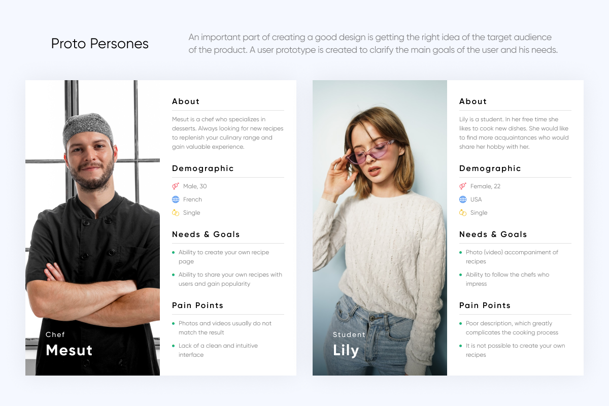
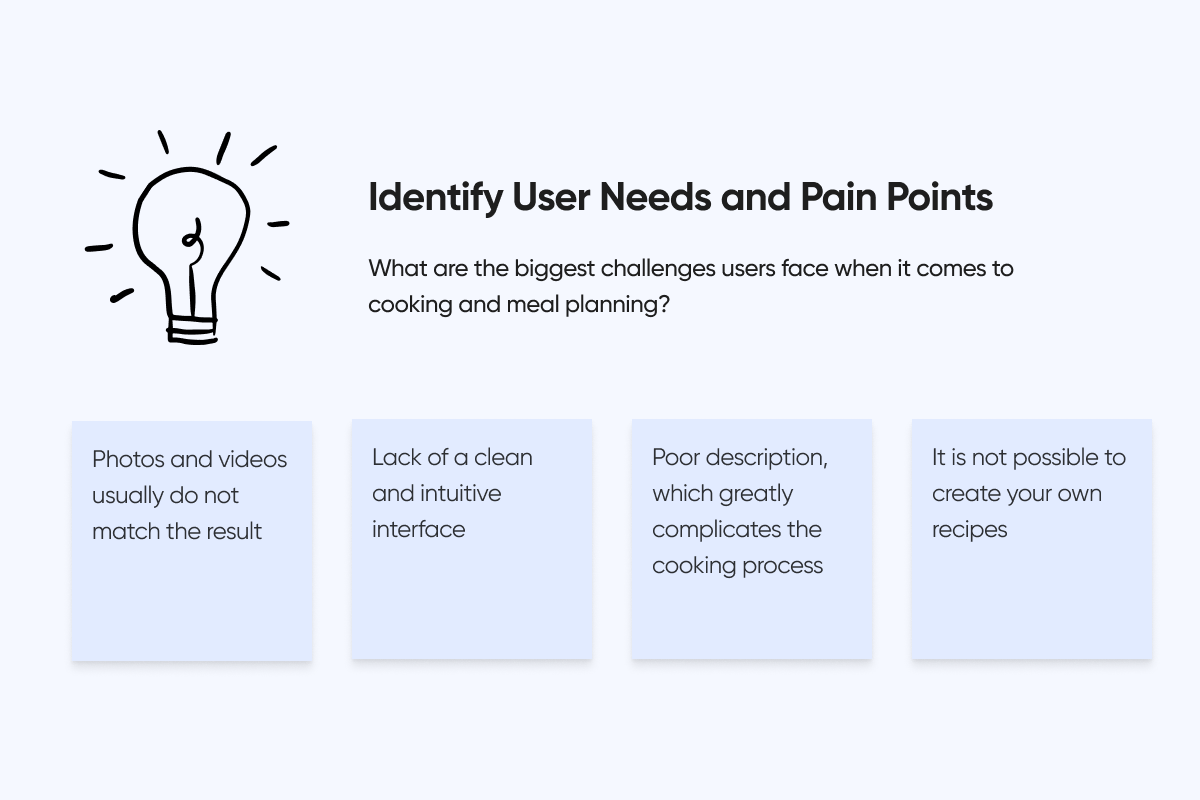
Take, for instance, the possibility of your website featuring small buttons that might go unnoticed by your target audience aged 40-60. This underscores the significance of User Experience (UX) design, which primarily involves delving into the research of the target audience—understanding their pains, needs, and how design can address them. I've delved into this topic further in an article about Design Thinking in UX Design, detailing how my team and leading companies globally apply this methodology in design and the outcomes achieved. If you're eager to explore this process, I highly recommend giving it a read. Additionally, you can glimpse into some of our pre-design research for Tastebuds below. While it's an application, the principles extend to website design as well.
Non-Responsive Website
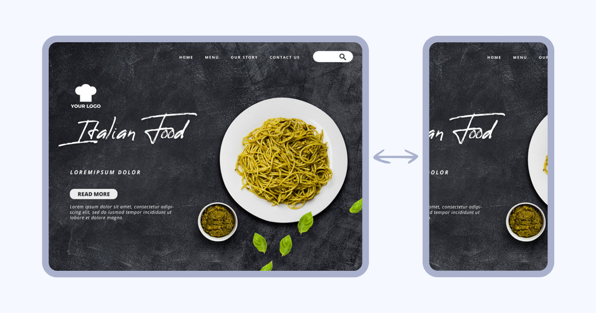
A responsive website automatically adjusts its layout and content to optimally display on any device, from desktop computers to smartphones and tablets. In contrast, a non-responsive website fails to adapt to various devices. You've probably encountered those websites on your phone, where only a fraction (about 1/4) of the site is visible, making it utterly inconvenient to access the content.
For instance, take a look below at an example of a non-responsive design. Now, put yourself in the user's shoes: would you feel inclined to place an order on a site like this?
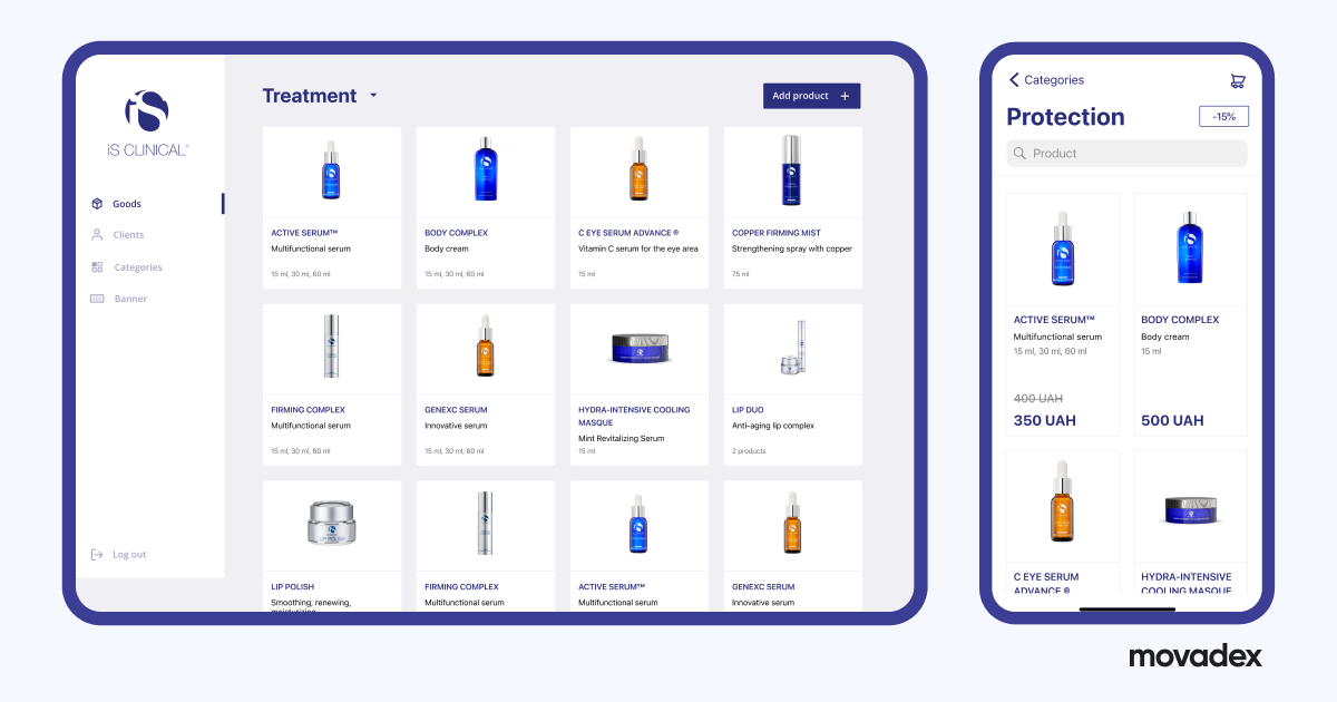
Here's an illustration of a responsive website that seamlessly adapts to different devices. This happens to be our work for iS Clinical.
- Google prioritizes mobile-friendly websites in search results. A responsive website is more likely to rank higher, leading to increased organic traffic.
- Responsive websites have a 53% higher conversion rate than non-responsive websites. (Shopify, 2023)
- 75% of internet users expect websites to be mobile-friendly. (Statista, 2023)
Abrupt Pop-ups
Pop-ups are those little browser windows that appear on top of the content you're viewing. They can be used for a variety of purposes, from collecting email addresses to promoting special offers. While some pop-ups can be helpful and informative, others can be intrusive and disruptive, leading to user churn and lost sales. I always recall the times when I visit a site, and right away, there's a pop-up that grabs my attention—with sound. This negatively affects the user experience.
- A study by ClickTale found that 63% of users find pop-ups annoying.
- A Baymard Institute study showed that 70% of users are more likely to leave a website with intrusive pop-ups.
But don't get me wrong, it's not like pop-ups are a total no-go. Take, for instance, a well-timed pop-up with a killer offer, no sudden appearances, and, of course, no annoying sound. That kind of pop-up can amp up conversions.

Lack of Payment Transparency
Payment transparency refers to the openness and clarity with which companies communicate their pricing, fees, and billing practices to consumers. Conversely, a lack of payment transparency occurs when such information is obscured, hidden, or ambiguous. This can lead to a cascade of negative consequences for businesses, impacting user trust, churn, and ultimately, sales.
- 73% of online shoppers say clear and upfront pricing is crucial for building trust with retailers. (Invesp, 2023)
- 49% of users abandon purchases due to unexpected fees or hidden costs. (Baymard Institute, 2023)
Errors
Website bugs are errors, flaws, or glitches within a website's code or functionality that affect its performance or user experience. These can range from minor inconveniences like typos or broken links to major issues like crashing pages, security vulnerabilities, or inaccurate information. Creating a quality website or app is a significant part of the process, ensuring that it fully meets the requirements and exceeds user expectations.
- 88% of online shoppers say they *wouldn't return to a website after having a bad user experience. (*Pulsion)
- CISQ update report estimates that the cost of poor software quality in the US has risen to at least $2.41 trillion, although not in similar proportions as observed in 2020. The accumulated software Technical Debt (TD) has increased to approximately $1.52 trillion.
Regardless of what industry your business is operating in, the possibility of security issues or malfunctions arising never vanishes. As the world is becoming more technologically advanced and innovation-driven, the expectations for the functionality of the software and its protection are continuously growing. Some of the most common problems include sloppy code, broken links, the absence of call-to-actions, outdated design, and poor user experience, especially on mobile devices. That’s why the QA team targets these and more problems that undermine the successful performance of your website.
Not Appeal to Your Target Audience
Before you start creation the website, it's crucial to identify the market fit. This involves understanding the needs, wants, and pain points of your target audience and determining whether your platform offers a unique value proposition that addresses them.
For instance, Revenue Roll approached us to redesign their website, as it was neither generating sales nor appealing to their target audience.
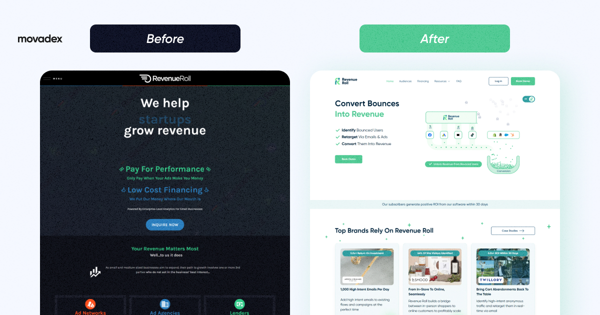
To remedy this, we integrated creative branding, user-centric website design, and advanced analytics to develop a cohesive platform that provides businesses with the necessary tools to excel in the competitive landscape. Through the utilization of data-driven insights, businesses can align their strategies with market trends, promoting sustainable growth and profitability.
Lack of Hook
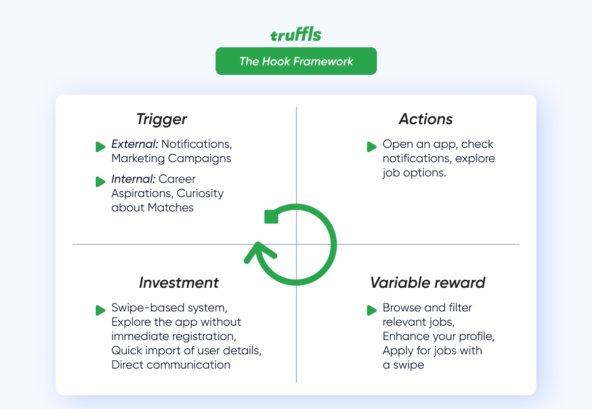
Hooks it's the absence of that captivating element that draws users in and makes them want to engage. For instance, using things like animated elements, product demos, or content created by users can grab attention and get people involved. Think of videos that explain products or virtual tours in 360°. By the way, this is a trend in real estate for 2024.
Poor Branding
The way your company is perceived by consumers determines its growth potential and overall position in the market. Creating a strong brand plays an equally important role in building a quality product. Strong brands have more engaged employees who can help their company grow profits 3x faster than their competitors.
If you've sent in a logo with low quality or incorrect meanings, it's a good idea to reach out to designers. After all, branding is a combination of design and marketing working together in synergy.
There is No Clear Call to Action (CTA)
The absence of clear calls-to-action (CTAs) or an excess of them can impact the overall user experience and lower your conversion rates. For instance, if you operate a marketplace, phrases like "Learn More" or "Contact Us" can provide information but may lack urgency and specificity. However, personalized call-to-actions perform 202% better than basic CTAs.
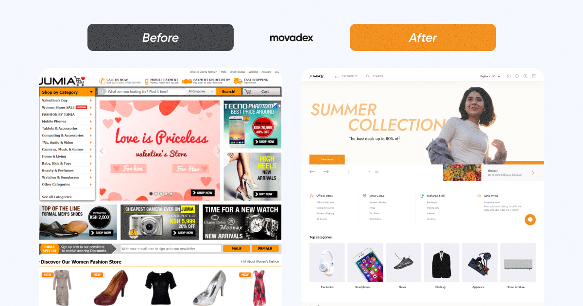
In a practical scenario, when we redesigned the Jumia e-commerce website, we paid careful attention to incorporating clear and unobtrusive CTAs alongside the overall redesign effort.
4 ways to improve your web design to increase sales
To enhance the website, it's crucial to identify and address the errors mentioned in the previous paragraph. Recognizing and rectifying these issues marks significant progress. In the following paragraph, I will categorize and guide on addressing the most common errors leading to low conversions on the site.
Simplify, Personalize, Captivate – The Winning Formula
a) Avoid cluttering your design with unnecessary elements. Keep in mind the importance of white space, especially during holidays when your marketers may introduce hooks and offers that require space on the site. A clean and intuitive design ensures users can effortlessly find what they are looking for, fostering a positive and satisfying interaction with the website.
b) Personalize: From "you might like it" to emails stating "you left items in your cart." Implementing personalization in web design creates a sense of relevance, making users feel seen and understood, ultimately boosting engagement and satisfaction.
c) To truly stand out in the digital landscape, a captivating design is paramount. Visually appealing elements, creative use of multimedia, and a cohesive brand identity capture visitors' attention, leaving a lasting impression. Don't forget the framework hook rule.
Prioritize Your Website's Security
Access to sensitive data, particularly customer data, is a pivotal aspect of cybersecurity. Regular access checks, role-based access, and the application of robust authentication methods, such as Multi-Factor Authentication (MFA), are crucial. MFA enhances security by requiring users to provide two or more verification factors to access a resource, significantly reducing the risk of unauthorized access.
Open-source software is often a primary target for cybercriminals. Therefore, it is crucial to regularly audit and update licenses, software, and testing procedures. Our quality assurance team, for instance, can assist you with these measures.
At Movadex, we always recommend to our clients how crucial it is to test their website or app. Depending on your budget and our expert advice, we'll advise the type of testing your application needs, considering all the conditions mentioned earlier. This way, you can see examples of both manual testing and automated testing in action.
Optimize Your Website With SEO
When trying to figure out how to improve your ranking on Google, you should always turn to both UX and SEO. It is important to understand that User Experience is broader than just a design thing: it is the whole science of making your website comfortable and easy to stay at. SEO, in its turn, is also not just a whole lot of keywords crammed into one sentence. The most important drivers of good SEO are technical, on- and off-page optimization.
After all, more than 50% of all web traffic comes from smartphones. There is a lot of cool data you can check out at the link above. As you can see, it is crucial to have a mobile-optimized website. Moreover, some may argue that the current trends suggest that you should build your whole online presence around smartphones first. Google has made it clear that your priority is mobile optimization, as it is indexed and ranks you based on how well your site runs on smartphones.
Don’t overlook page speed — the frequently unnoticed factor that can significantly impact your website's performance and profitability.
- 40% of users abandon a website that takes more than 3 seconds to load. (Source: Google)
That's why we collaborate with an SEO team during the creation of your websites. For instance, in the case of Artstead, we ensured that their site ranked high by incorporating good semantics and relevant content on all pages. Additionally, we prioritized fast loading times for every page.
Use Psychological Principles to Build Customer Confidence
Goal Gradient Effect: This psychological principle suggests that people are more motivated to complete a task as they perceive themselves getting closer to a goal. In eCommerce, you can apply this by offering rewards or bonuses for reaching certain purchase thresholds. For example, "Spend $50 more to earn a $10 discount."
Starbucks employs the goal gradient effect by offering rewards for frequent purchases. They have a tiered loyalty program where customers earn stars for each purchase. As customers accumulate more stars, they move closer to higher reward levels, motivating them to make additional purchases to reach the next tier.

Zeigarnik Effect: The Zeigarnik Effect suggests that people remember uncompleted or interrupted tasks better than completed ones. In eCommerce, this principle can be applied by using progress bars or reminders to encourage users to complete their purchases. For instance, "Your cart still has items waiting for checkout.”
Booking.com effectively utilizes the Zeigarnik effect by displaying a message like "Hurry, only 1 room left!" on hotel booking pages. This creates a sense of urgency, making users more likely to complete their booking before losing out on the last available room.
Anchoring Bias: People often rely heavily on the first piece of information they encounter when making decisions. In eCommerce, setting a higher initial price for a product (anchor) and then displaying a discounted price can influence customers to perceive it as a better deal, even if the discount is modest. For example, showing "Originally $99, now $79" can make $79 seem like a steal.
Amazon often uses the anchoring bias by showing a higher "list price" alongside the current price, highlighting the perceived discount. For instance, they might display "List Price: $129, Price: $99" to make the $99 price seem like a better deal compared to the original price.
Authority Bias: Collaborating with influencers or industry experts to curate lists of products can boost credibility and trust in your eCommerce platform. Users are more likely to make a purchase when they see recommendations from authoritative figures they admire.
Sephora collaborates with beauty influencers and makeup artists to curate collections of recommended products. These influencers have authority in the beauty industry, and their product selections are featured on Sephora's website, increasing customer trust and the likelihood of purchases.
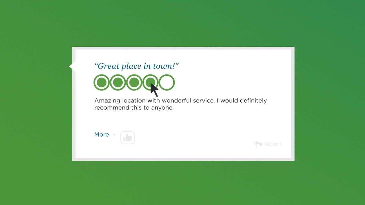
Social Proof: Displaying user reviews and ratings can significantly impact purchasing decisions. Seeing positive feedback from other customers builds trust and confidence in your products and services.
TripAdvisor is a well-known travel website that provides user-generated reviews and ratings for hotels, restaurants, and attractions worldwide.
Boost Sales with Web Design from an Award-Winning Web Design/Development Agency
If you are in search of a web development agency, feel free to consider our services at Movadex. With 7 years of experience and a track record of empowering over 200 projects across diverse sectors such as e-commerce, sustainability, fintech, aviation, KYC, and healthcare, we specialize in revolutionizing digital products and services. Learn more about our work here, and don't hesitate to reach out to us for a consultation here. We're here to help with your web development!
