The design never stands in one place for too long, that's a fact. Today, I wanted to celebrate the year 2021 – the creative year. Let's dive in!
#1. Nature-Inspired Designs
The idea of mimicking nature is not new and has been with us for centuries. Thankfully, it's coming back with a new trick up its sleeve.
 We had a concept done for the animal recognition app. Using earthly tones, our designers were able to connect the digital world with nature, and it looks awesome. Web design is pretty akin to a playground, and many experiments are to be made there, that's for sure. That's why we enjoy it.
#2. Isometric 3D
Isometrics has been with us for a few years now, but now it has evolved into 3D and is used most this way. We are not strangers to it, take a look at a few shots prepared by our team.
 We all remember the buzz of Cyberpunk 2077 when it came out. But we made a little crossover here, adding Elon Musk's new Cybertruck to the action. Looks awesome, made me want to play the game again.
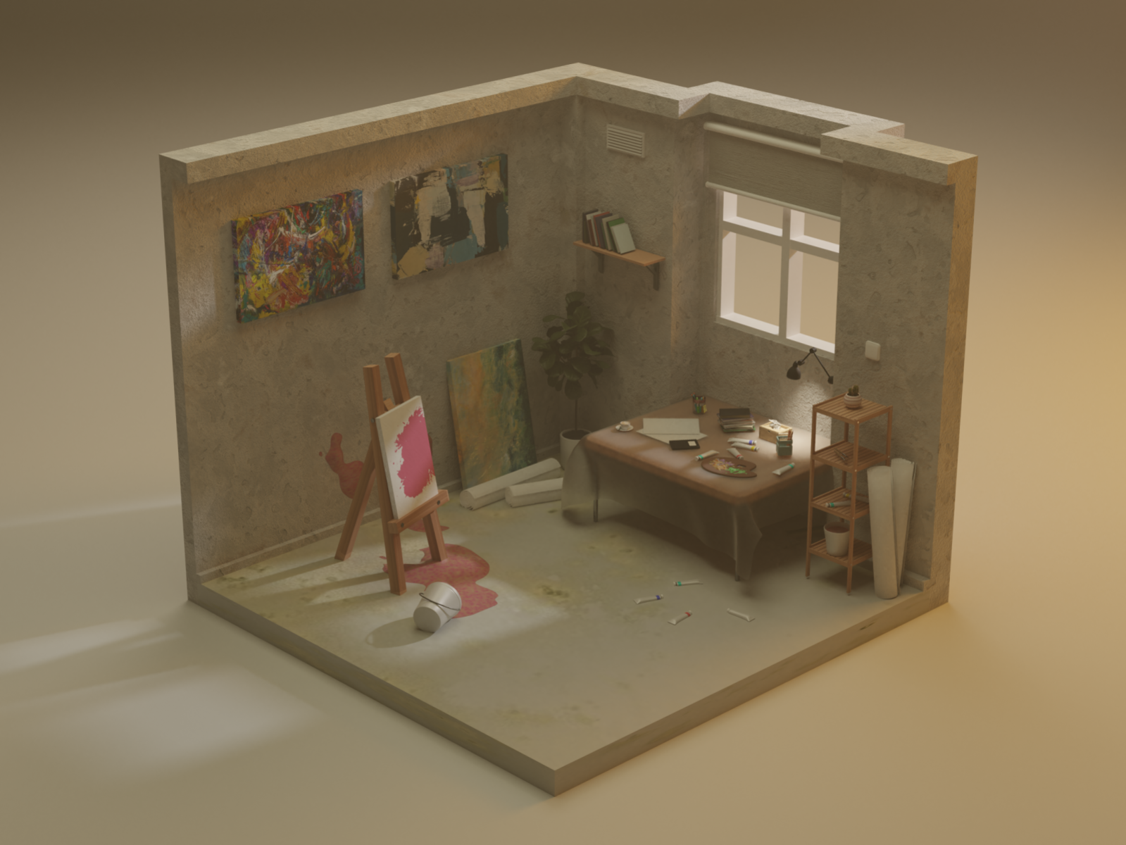 Here's another bit from our team. Truly, a creative mind needs its creative mess. And here's our landing page reimagined. It looks awesome, wish we turn it into reality as soon as possible!

#3. Dark Mode on Default
Most of the websites are either plain white or offer dark mode switches. But what if you break the system and include only the dark version? There are plenty of upsides here: it reduces eye strain, it helps you to stand out from the crowd, makes you more memorable.

#4. Frasurbane
Ah yes, the 90s post grunge era. Filled with beige color and serif fonts everywhere, this trend started to slip in and make its way to the top. And here we are – it's in our trend list. We have done a few concepts in Frasurbane as well.
 Honestly, what not to love about it? To me, it doesn't look old-fashioned or bad for a modern website. On the contrary, I think it looks fresh.

#5. Mobile First Designs
You know, we are slowly moving away from using our laptops and PCs in favor of our phones. The industry does its best to adapt, putting more effort into the mobile experience than the desktop one. It's easy to get where it's coming from: all the websites have more mobile traffic than any other.
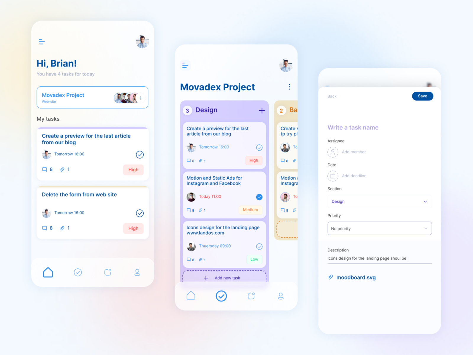 This trend is something bigger than just a fluke that goes away in a few weeks or years. You can take almost every business as an example: it's completely normal to have a landing page and a download link that leads you to App Store.

Summary
It's been a wild year for many reasons, but we are here to celebrate the new experiences that design trends have brought us. New Year prediction for you: lookout for more mobile things, they aren't going anywhere.

