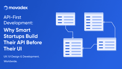
Good design is not luck. It is the result of clear user research. For early-stage founders, budgets are small and timelines are short, but skipping UX research is a mistake. The goal is not to collect endless data. The goal is to understand what people need and why they behave the way they do.
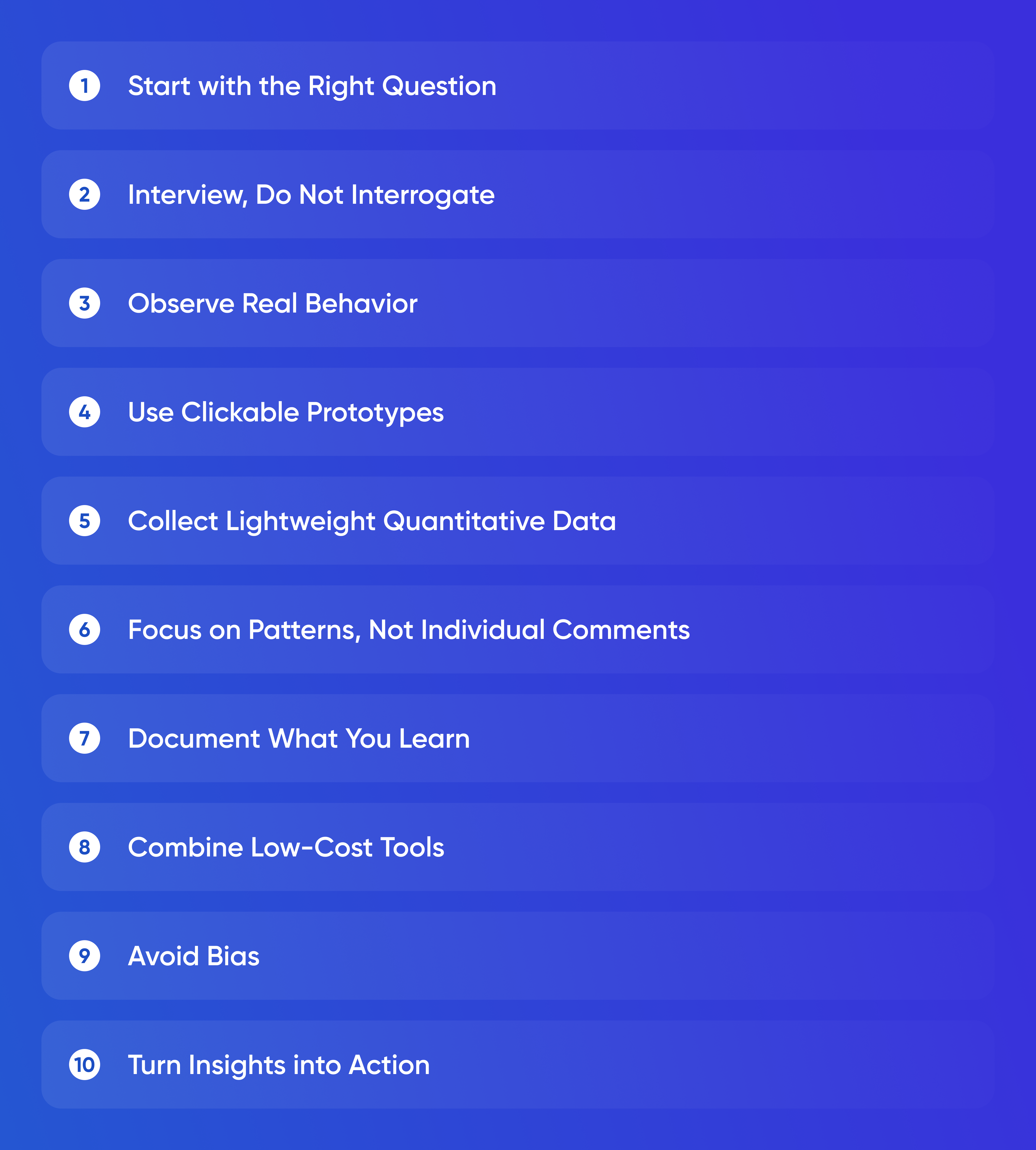
Start with the Right
Question
Effective UX research begins with one question that defines your learning target. It might be, “Do users understand what problem this app solves?” or “Can users complete the main task without help?” This focus prevents you from drowning in irrelevant feedback. If you cannot express the question in one sentence, your scope is too wide.
Research is about clarity, not volume. Five well-chosen conversations will teach you more than a thousand survey responses with no context. Early-stage founders should spend their limited time uncovering friction, not collecting vanity data.
Interview, Do Not Interrogate
User interviews are the cheapest and most powerful method available. They require only curiosity, empathy, and discipline. Approach interviews as conversations. Avoid leading questions like “Do you like this feature?” Instead ask “Tell me about how you currently solve this problem.” Then stay silent. People reveal insights in their stories, not their ratings.
Record calls, transcribe them, and highlight phrases that repeat across participants. These repetitions form patterns that will later shape product decisions. Pay attention to emotion words such as “frustrating,” “slow,” or “finally.” Emotion predicts action better than opinion.
Observe Real Behavior
What users say often differs from what they do. Watching real interactions eliminates guesswork. Tools like Lookback or simple screen recordings help capture user sessions. Even five sessions can expose navigation confusion or unclear wording.
The rule of thumb is simple: if two people struggle with the same step, the issue is real. Fix it before asking more people. Iterating after every few sessions is faster and cheaper than waiting to run a large formal test.
Use Clickable Prototypes
Clickable designs give users something tangible to react to. You can create them in Figma or similar tools without writing code. A prototype should represent one flow from start to finish. Show it on a laptop or phone and ask the participant to think aloud as they use it. Listen to what they expect to happen next.
This process validates structure and language long before engineers touch the codebase. A good prototype round prevents costly redesigns later. It also creates confidence when presenting to investors or partners.
Collect Lightweight Quantitative Data
Not all research must be qualitative. Add small experiments with metrics that matter. For example, test two versions of your landing page and track signup rates. Send onboarding emails with different subject lines and measure open rates. Simple analytics can reveal which value propositions resonate most.
The key is to keep experiments small and frequent. Each one should answer a single question and end within a few days. Continuous micro-tests build a stronger intuition than one large survey every quarter.
Focus on Patterns, Not Individual Comments
Founders often fixate on a single piece of feedback from a loud user. Resist that impulse. Instead, look for patterns across interviews and sessions. If one person complains, it might be preference. If five people struggle, it is a signal. Prioritize changes that solve repeated pain points. This approach avoids feature chaos and keeps design coherent.
Document What You Learn
Insight loses value if it stays in your head. Create a short research summary after every batch of interviews or tests. Write what you learned, what decisions it informed, and what you plan to explore next. Keep it under one page so teammates can read it quickly. Over time, these summaries form a knowledge base that prevents revisiting the same questions.
Use simple language. Investors and non-design teammates should understand it easily. When you communicate insights clearly, you turn research into a shared compass rather than a design artifact.
Combine Low-Cost Tools
There is no need for expensive software. Free tools handle most of the process. Google Forms works for quick surveys. Figma handles prototypes. Loom records user sessions. Miro captures journey maps. Use what you already know. The strength of research lies in curiosity, not in platforms.
Avoid Bias
Founders naturally want validation. That bias can distort research outcomes. To reduce it, have someone else moderate at least a few sessions. If that is impossible, script your questions in advance and read them verbatim. Avoid explaining features during testing. Every time you guide a user, you lose an opportunity to observe confusion.
Turn Insights into Action
Research has value only when it changes something. Translate findings into design updates, copy changes, or product decisions. For instance, if users hesitate at pricing, adjust communication rather than building new functionality. Each change should map directly to a discovery.
Create a visible feedback loop where insights lead to actions, and actions lead to new insights. This rhythm builds a culture of learning even with a small team.
Conclusion
UX research on a tight budget depends on focus, honesty, and iteration. Start with a single question. Talk to real users. Watch them use the product. Write down what repeats and act on it. Expensive labs and large samples are not required to build something users love. What matters is your ability to listen, observe, and adapt faster than competitors who build blindly.