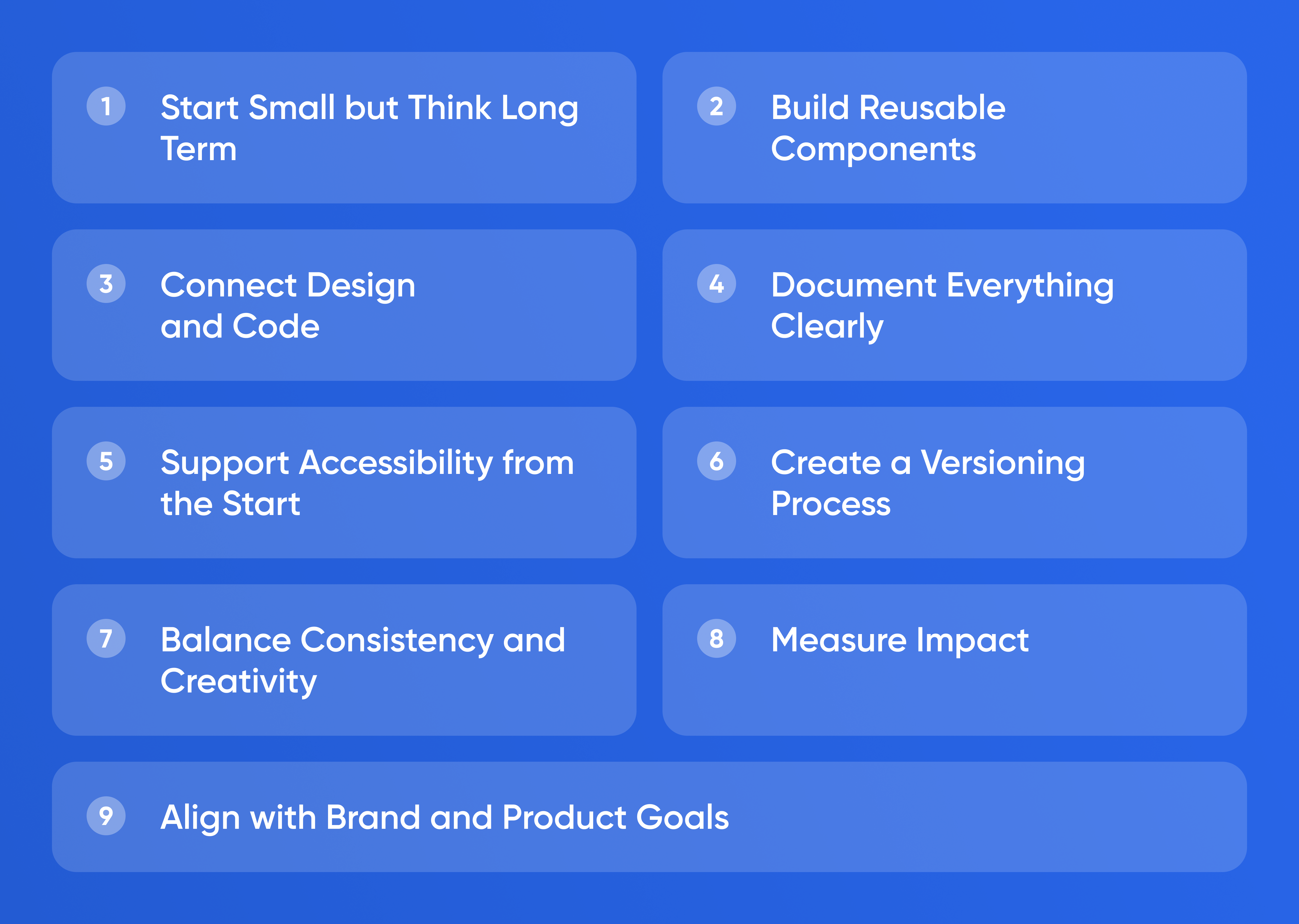
A design system is the invisible engine behind every fast and consistent product team. It defines how buttons look, how spacing works, and how interactions behave. For startups, a design system is not a luxury. It is a time-saving tool that keeps teams aligned while they move quickly. When built well, it reduces design and development time by half and keeps your brand coherent as you scale.
Start Small but Think
Long Term
A design system does not begin with hundreds of components. It begins with decisions. Start by defining colours, typography, and spacing. These tokens form the foundation for everything that follows. Each token should have a name that reflects its function, not its appearance. For example, use “primary-colour” instead of “blue.” This allows future flexibility if you rebrand or adjust themes.
Document these tokens in one shared source. Tools like Figma, Notion, or Zeroheight make it easy to centralise updates. When you add or change something, everyone sees it instantly. This visibility prevents drift between design and code.
Build Reusable Components
Once the foundation is clear, move to components such as buttons, inputs, cards, and modals. Each component should include visual rules, states, and usage notes. For instance, a button system should define default, hover, and disabled styles along with spacing and text size. Consistency in these basics eliminates countless micro-decisions later.
Keep components modular. Designers and developers should be able to assemble complex screens by combining a few pieces rather than redrawing everything. When teams reuse components, every improvement—such as better accessibility or performance—spreads instantly across the product.
Connect Design and Code
A design system only works when design and development stay in sync. Developers should implement components in a shared library that matches the design files. Frameworks like React or Vue make it simple to create component libraries with consistent styling.
Keep visual and code tokens linked through automated pipelines where possible. For example, colour variables defined in design can sync directly to CSS variables or theme files. This bridge removes manual errors and keeps interfaces pixel-perfect across platforms.
Document Everything Clearly
Documentation is what transforms a collection of components into a real system. Every element should include a brief description, usage rules, and examples. The goal is to help any new team member design or build a screen without asking questions.
Good documentation is readable by both designers and engineers. Include screenshots, code snippets, and accessibility notes. Write in plain language instead of abstract design jargon. Simplicity encourages adoption.
Support Accessibility from the Start
Accessibility should be built into your design system, not added later. Choose colour contrasts that meet WCAG standards, define text hierarchies for screen readers, and use consistent focus states for interactive elements. Each accessible rule you add once saves hundreds of fixes later.
Accessibility is also good business. It expands your audience and demonstrates maturity to partners and investors. The startups that design inclusively from day one scale faster because they need fewer redesigns.
Create a Versioning Process
As your product evolves, so will the design system. Create a simple versioning workflow. Each update should include release notes that describe what changed and why. Teams can then decide when to adopt new components. This structure prevents chaos and broken screens during updates.
A regular release cycle—monthly or quarterly—keeps the system alive without overwhelming teams. Announce updates in a shared channel and explain new patterns with short demos. When people understand the reason behind changes, they follow them willingly.
Balance Consistency and Creativity
A design system should guide, not restrict. Encourage experimentation within boundaries. When designers propose new patterns, they should document them and run quick usability tests. If the new element proves useful, integrate it into the system. This keeps innovation flowing without breaking uniformity.
Rigid systems die because they stop learning. Flexible systems thrive because they evolve based on evidence. The key is to document variation deliberately instead of letting it spread unnoticed.
Measure Impact
You can measure the success of your design system by tracking time saved and errors avoided. Compare the number of custom components before and after adoption. Monitor the time it takes to build a new feature or redesign a page. When teams reuse components effectively, speed improves, and defects decrease.
Collect qualitative feedback too. Ask designers and developers whether the system makes their work faster and clearer. A healthy design system feels empowering, not limiting.
Align with Brand and Product Goals
A design system expresses your brand’s personality through structure. Typography conveys tone. Colour sets emotion. Interaction style communicates confidence or playfulness. Review your visual identity regularly to ensure it matches your brand message.
As you grow, the system becomes part of your culture. It teaches new hires what “quality” means inside your company. It also ensures that marketing pages, apps, and dashboards feel like one coherent product family.
Conclusion
A design system is both a strategy and a tool. It gives startups speed, precision, and consistency without slowing creativity. Start small with tokens, grow into components, link design to code, and document everything. When everyone on your team speaks the same design language, you build faster and with fewer mistakes—and your product feels unified from the first pixel to the last.