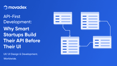
The landing page is the most important thing on any website. Ever wandered onto one and ended up thinking what the hell this company is about? That's right, their landing page is just bad. It has to state a clear message, conveying what this brand is all about, what they do, and why. LP's goal is to make people understand these things in mere seconds, and if it fails to do so, you will lose clientele!
What Do I Do?
There are some main points you should consider when creating a great landing page for your business. These are very essential, so you better listen well.
Headline & Subheading
Easily the most important thing on your landing page. These two tell the client about you everything that they have to know, at least they have to in theory. The headline is usually very short. It is meant to capture the reader in an instant, hooking them and making them read further. It is displayed in big bold letters, making it impossible to miss: our eyes will catch onto it automatically. The subheading is just as important. It's a chunk of text displayed in a smaller font below the headline. It is used to elaborate on your mission and what you do in general. Let's look at Slack's LP here. Pretty straightforward, and it gets the job done — you get what they do in mere seconds. I will cut you some slack here.
Provide a Solution
Businesses exist to solve their clients' problems. Every brand is there to make lives easier. What you want to do is include a solution to the problem people have with your LP. Ideally, they will be integrated into your heading & subheading. Slack does that with their subheading, they tell you what they do and how it solves your problem. The lesson to be learned here is simple: make the solution obvious for the reader.
Credibility
There are a lot of things you could do to boost your credibility. Websites usually use big bold numbers and client testimonials for those, although there are a lot of ways to make you look better in the eyes of potential clients. We use real reviews from Clutch on our website, and it's one of the best blocks you can include on your LP. Nothing works better than the real reviews from real people, not some Unsplash heroes.
Portfolio Or Use Cases
There might be no place for such things depending on the industry you're in, but I have to cover it anyway. Apart from all the testimonials, the second-most crucial element of your LP is your portfolio. Don't forget to include some cases when you lead your client to success, it will inspire newcomers to do business with you, boosting your conversions. We have a few blocks used for showcasing projects and they do their job pretty well. If you don't have any real-life examples yet, make them up, tell a story about how your product can potentially be useful! In short, don't waste the opportunity to shine bright like a diamond.
Perfect CTAs
Call to action is something you should invest a lot of thought into. It's your main way to get more conversions on your landing page, and the better they are, the more sales you'll get. You want the whole LP to be a clickable sales magnet, but don't overdo it, of course. There are a lot of places to put CTA at, but there are some generic places that work best, like your hero block, or footer. Some people will come to you ready to buy, so don't make their life too hard, make everything as obvious as possible.
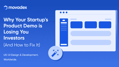
UI & UX
The best way to sum everything up is design. It has to be appealing and catchy, people love with their eyes first after all. It may be somewhat unfair, but even if you have the most awesome product on the market, you won't get as much business as people with good UI and UX. Clients value comfort and easiness of use first, it's important to remember that. Fortunately, it's not too hard to get a decent design nowadays, you just have to find the right people for the job. If you need some assistance in that regard, hit us up!